Archive for the ‘Art’ tag
Biking Culture……Bicycles in Doisneau’s Street Photography
Random Images……Le baiser de l’hôtel de ville (The Kiss)
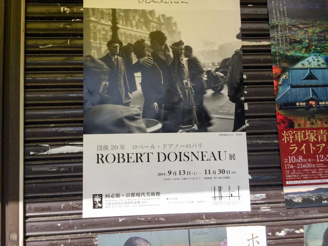
This poster led me to Kahitsukan, the Kyoto Museum of Contemporary Art, and a Robert Doisneau exhibit. Doisneau was a street photographer in Paris around the same time as Henri Cartier-Bresson.
Question: Does the fact that Doisneau staged this image change how you look or feel about it?
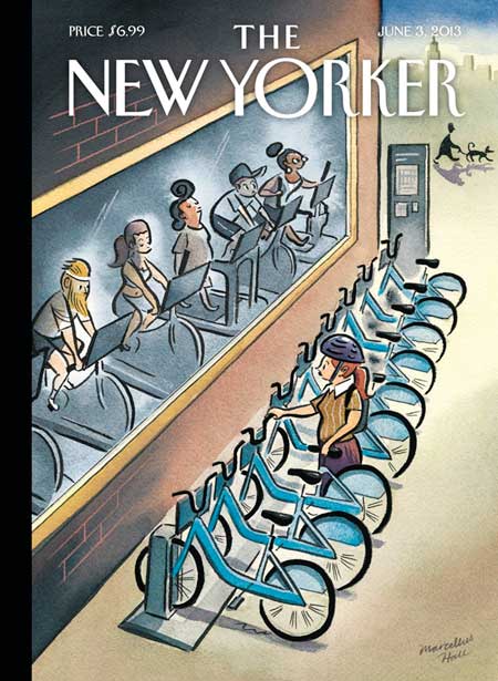
Biking Culture……The New Yorker bicycle covers, Part III
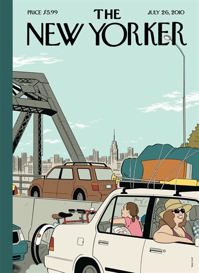
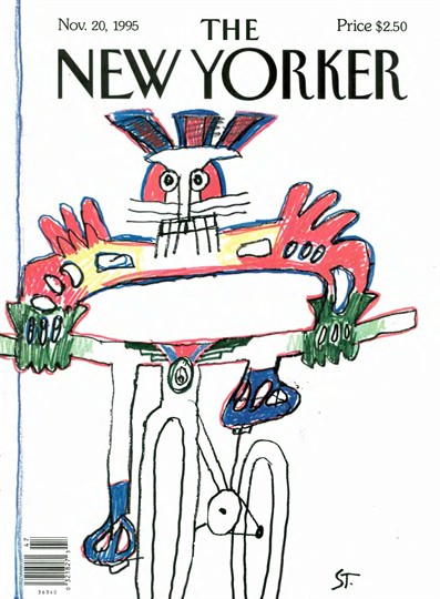
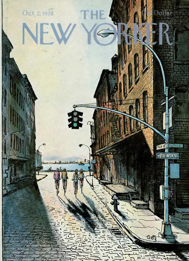
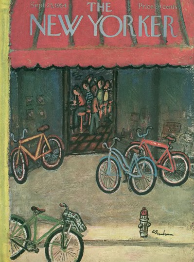
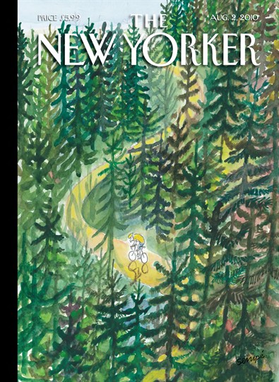
I’ve said it before: I think The New Yorker has a thing for bicycles (see Part I and Part II in this series of posts)
This time, with the introduction of NYC’s bicycle share program, the storied literary magazine has a genuinely newsworthy reason to feature bicycles on their cover.
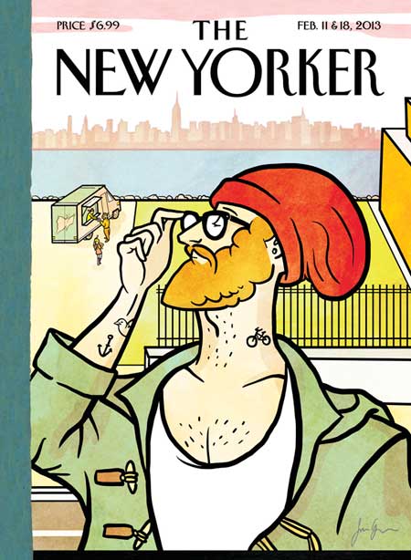
There was also this cover from back in February.
Can you count all the hipster tropes?
- thick-framed eyewear
- food truck
- body ink
- beard
- knit cap
- duffle coat w/ toggles
- discriminating (if not condescending) gaze
- Brooklyn residence
Did I miss anything?
On the Road……Coastal Sunset & Digital Metering w/ Sony RX100
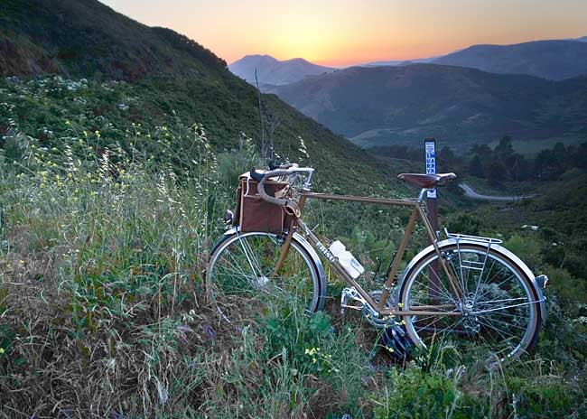
Here’s the sunset at 8:04pm from Thursday’s ride in the Marin Headlands.
The light was tricky. It was well into twilight, and there was a sharp contrast between the lightest and darkest areas in the scene.
(Note: roll your mouse over the image to see the extreme difference in the unprocessed camera file.)
For a landscape scene like this a serious photographer would typically use a large-sensor DSLR camera plus:
- a tripod (to allow for a long exposure to let in more light without introducing blur from inadvertent camera movements) and
- a graduated neutral-density filter (to control the scene’s dynamic range by reducing the brightness of the sky — but not the foreground).
However, my little Sony RX100 (reviewed here by NY Times tech writer David Pogue) handled the scene fairly well.
Here is the processing technique I recommend for this — or really any — digital photograph:
- Choose an exposure that preserves the brightest areas in the scene. That is, “expose for the highlights” to retain the vivid color and detail which might otherwise get “blown out”. Metering the scene like this will render the rest of the image too dark, but that’s okay. When mousing over the above image, you can see how everything — except the sky, the bike’s shiny metal parts, and the clear water bottle — is way (and I mean way) underexposed.
- Tweak the shadow areas in post-processing according to taste. Here is where we adjust areas that are too dark. When I opened-up the shadow areas in Photoshop using a curves adjustment layer there was surprisingly still enough detail hidden in the file to create a decent image (at least for viewing on the web). In most images the before/after differences will be less extreme, but the technique will be the same.
By the way, this is the exact opposite of what Ansel Adams did in his black and white film photography. He would “expose for the shadows“, that is, meter the darkest area of the scene to preserve wanted detail, then in the darkroom develop the highlights to taste.
The difference in technique is a function of how digital sensors and film emulsions handle highlight rendering. For a good discussion of Adams’ technique and his Zone System, see this article.
-Nathan
Random Images……Vermeer sighting at the de Young
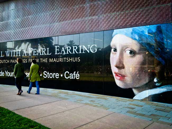
As promised, a few observations about the Dutch paintings exhibit currently on view at the de Young Museum.
Here are my six takeaways:
- The light from within. When I walked into the opening room of the exhibit I gasped — audibly — shocked by the sensory perceptions and emotions that flooded in as I first cast my eyes on the landscape paintings that radiated an inner glow. The light from within these paintings was so palpable I actually began to question my own experience, rationalizing that the museum’s sophisticated lighting had something to do with it.
- Presentation matters. The de Young did a superb job with the the overall design and display of the exhibit. How the paintings were arranged, the size and flow of the rooms, and even the space between paintings and their height from the floor, all seemed perfect. I’ve seen Vermeer paintings at the Metropolitan Museum in NY and Vermeer paintings at the National Gallery in Washington, DC. This kind of art has never looked as good as it does here in San Francisco.
- I prefer “old” art to “modern” art. A huge generalization, but so much of modern art seems designed to provoke or to extol things like irony, cynicism, and even ugliness. Yet these paintings inspired and uplifted me and that is the best justification for art in my opinion.
- My appreciation grows with age. My capacity to appreciate and be affected by this kind of art has truly deepened over time. My life experiences and accumulated wisdom (at least what there is of it) allows me to see and feel deeper than I could when I was in my 20s, for instance. This may not be anything revelatory, but it was a big takeaway for me.
- On masterpieces. Is there such a thing? Are they overrated? Some of the “greatest hits” from the masters are now devalued cliches. Derivatives and crude, poorly reproduced facsimiles show up in pop culture, in digital media, or on billboards. So I stood in front the actual physical object of Girl with a pearl earring looking for a long time to decide for myself if it is, indeed, a masterpiece. The answer: Yes it is. By the way, so too is Rembrandt’s Portrait of an elderly man, which is also part of the show.
- Fewer is better. I prefer small exhibits to large exhibits, and this is a relatively small exhibit. In fact, a long time ago I stumbled upon a useful practice after spending many grueling hours at the Louvre in Paris. This simple principal has guided me ever since: Never spend more than 45 minutes in a museum, 30 minutes would be even better. It’s much more satisfying to look intensely for 30 minutes, rather than to look superficially for 1-2 hours. That’s my advice. Plus, you can always return another day. Return I will because I didn’t have time to see all Rembrandt’s pencil drawings and etchings.
I don’t know why, but I went in with low expectations and, instead, came away pleasantly surprised.
Overall rating: Five stars!
The show runs through June 2nd.
-Nathan
On the Road……Above Bonita Cove: Views of the Bridge and Sutro Tower
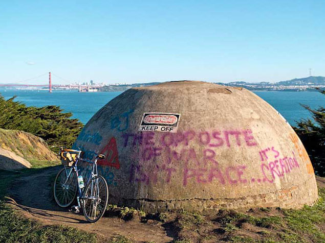
I’m not exactly sure what this graffiti artist is trying to communicate. Perhaps, it’s that war = destruction? (since the opposite of creation is destruction).
But speaking of language, the December 24th issue of The New Yorker magazine had a curious article by Joshua Foer about an amateur linguist named John Quijada. When he wasn’t working at the Department of Motor Vehicles, Quijada spent his spare time (extending over 25 years) engineering a new language and grammar system combining what he believed were the best aspects of all the world’s languages.
Here’s a quote from the beginning of the article:
In his preface, Quijada wrote that his “greater goal” was “to attempt the creation of what human beings, left to their own devices, would never create naturally, but rather only by conscious intellectual effort: an idealized language whose aim is the highest possible degree of logic, efficiency, detail, and accuracy in cognitive expression via spoken human language, while minimizing the ambiguity, vagueness, illogic, redundancy, polysemy (multiple meanings) and overall arbitrariness that is seemingly ubiquitous in natural human language.”
Ithkuil has two seemingly incompatible ambitions: to be maximally precise but also maximally concise, capable of capturing nearly every thought that a human being could have while doing so in as few sounds as possible. Ideas that could be expressed only as a clunky circumlocution in English can be collapsed into a single word in Ithkuil. A sentence like “On the contrary, I think it may turn out that this rugged mountain range trails off at some point” becomes simply “Tram-m?öi hhâsma?p?uktôx.”
This is really quite odd.
Ithkuil seems to be a language devoid of nuance, implication, metaphor, and for that matter: poetry!
Random Image……Cargo Bike at Dunphy Park, addendum
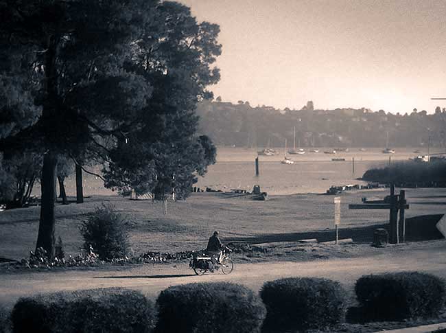
As a follow-up to the previous post, here’s one final traditional B&W darkroom variation called a duotone (For an in-depth, but slightly outdated photoshop tutorial and explanation of dutones see this article on the Luminous Landscape website.)
The highlights (i.e. the brightest areas of the tonal range) receive the sepia tint and the shadows (the darkest areas) receive the blue tint.
Actually, this may be my favorite version so far.
Random Images……Muhammad Ali and Grandson
I first saw this image on the back cover of The New Yorker magazine. I find it to be a beautiful and tender portrait.
Forget that it is a Louis Vuitton ad. Forget that the world’s highest paid and most famous portrait photographer, Annie Leibovitz, created it. Just appreciate it.
And this reminds me to add Muhammad Ali to my personal list of heroes, which was published in a previous post.
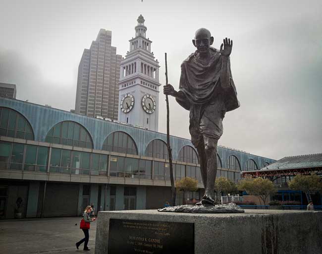
Random Images……Public Sculpture in SF, II
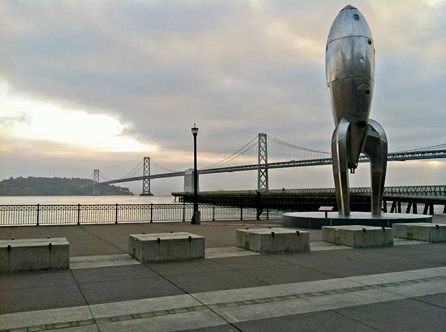
I pass this scene almost every morning riding from the Ferry Building to work.
On this morning, there was a feeling of intense presence infusing the whole cityscape created by the arrangement of the sculpture, the bridge, the plaza, the water, the sky, and the light!
Christopher Alexander‘s writings come to mind:
Centers are those particular identified sets, or systems, which appear within the larger whole as distinct and noticeable parts. They appear because they have noticeable distinctness, which makes them separate out from their surroundings and makes them cohere, and it is from the arrangements of these coherent parts that other coherent parts appear. The life or intensity of one center is increased or decreased according to the position and intensity of other nearby centers. Above all, centers become most intense when the centers which they are made of help each other. (From Volume I, The Nature of Order)
Random Images……Public Sculpture in SF, I
Random Images……Public Sculpture in SF, III
Mahatma Gandhi, one of my heroes (see this post for a complete list).
Bicycling Culture……SF’s Critical Mass at 20
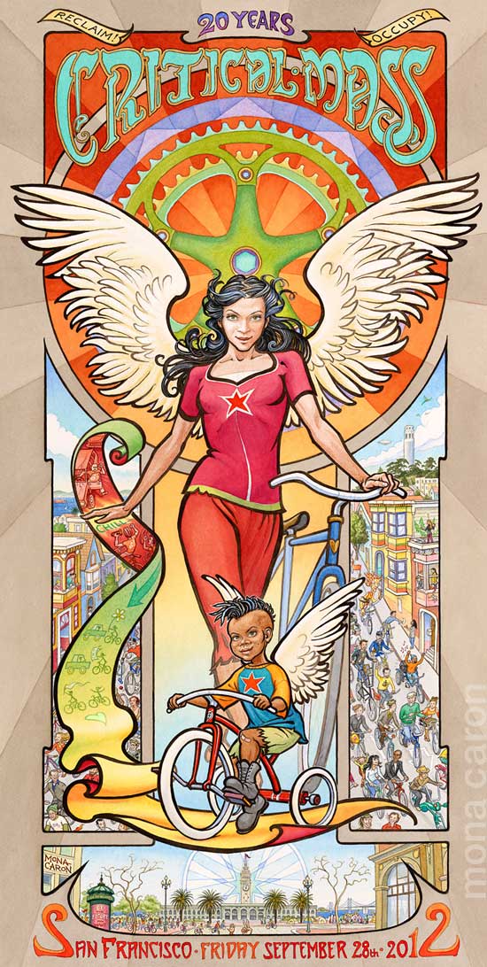 This past Friday, SF’s Critical Mass rolled out from Justin Herman Plaza in the Embarcadero as it has for the last two decades. In fact, September marks the ride’s 20th anniversary. Here is artist, Mona Caron‘s poster marking the milestone.
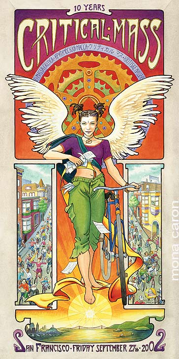
Below, is the poster she created for the 10-year anniversary.
Random Images……May the Fourth (Force) be with You.

Han and Chewy taking a breather after tearing up some single track.

Bobba Fett using his cargo bike to haul Han (frozen in Carbonite). By Mike Joos via Awesomenator
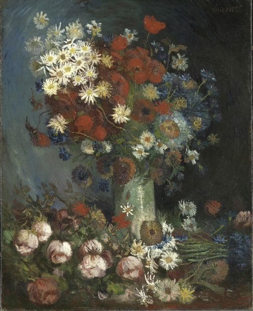
Random Images……A New Van Gogh Discovered!
Speaking of art.
Did you hear a new painting by Van Gogh has been discovered? It’s stunning!
Read about the discovery here.
Random Images……Creative Photography
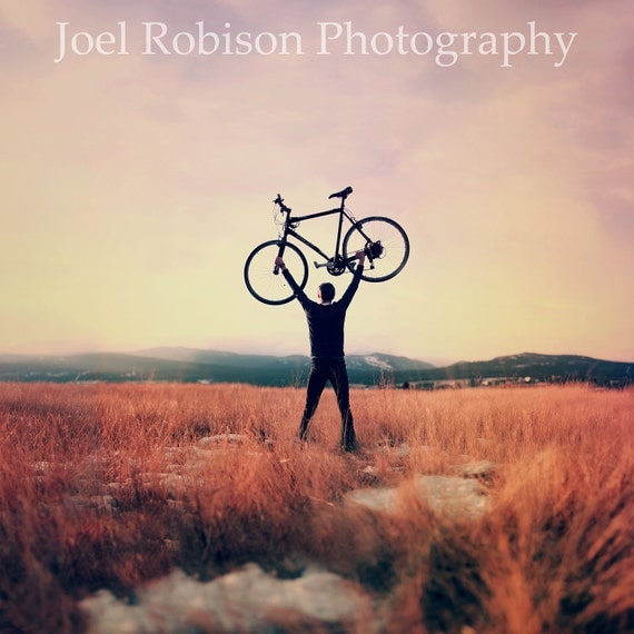
I love bikes and photography — and this talented artist does too.
Read about his creative process (and peruse his dreamlike and whimsical images) in this interview by Alexandra Cameron on her blog .
Or see more of Joel’s work on Flickr, including more bicycle shots like this one and this one.
Great stuff!
Random Images: Copenhagen Zoo, Bus Advertisement
Staying with the theme from my previous post here’s another image from the world mecca of bicycle-friendliness — Copenhagen.
I heart good public transportation options (especially when coupled with wonderful graphic design like this).
Bicycling Culture……Ville vs Velodrome, graphic art
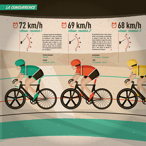
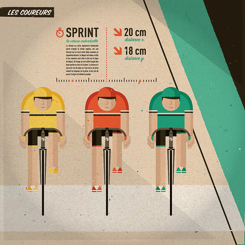
For that small segment of folks that occupy the space at the intersection of design and velo-fandom, I present samples of Guilherme Henrique’s “eight illustrations representing the adrenaline of riding fixed-gear bikes in the city and on the velodrome.”
Here’s a short summary from Prolly is Not Probably:
Guilherme Henrique is a graphic designer and as far as I can tell, Ville Vs. Velodrome is a case study on the scale of the city, the bike rider, the velodrome, racers and their bikes. Each of the templates have detailed descriptions as to what is the quantifying or qualifying characteristics of the scale stepping.
Bicycle Culture……The Adventures of Tintin
The Adventures of Tintin (by Herge) have been adapted into a film by Steven Spielberg and Peter Jackson set for release in the US later this month. Some Tintinologists don’t care for the movie; but, I’m keeping an open mind and hoping for the best.
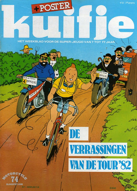
Here’s a European magazine cover promoting the 1982 Tour de France with Tintin leading a breakaway with Captain Haddock, Prof. Calculus, and Thompson and Thompson in pursuit.
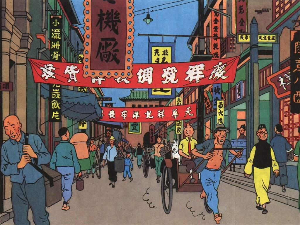
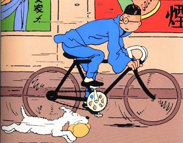 …and here’s Tintin on a hipster-like-single speed (just some of Herge‘s artwork from The Blue Lotus — arguably one of the best Tintin adventures).
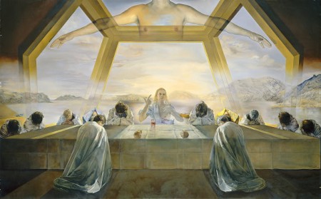
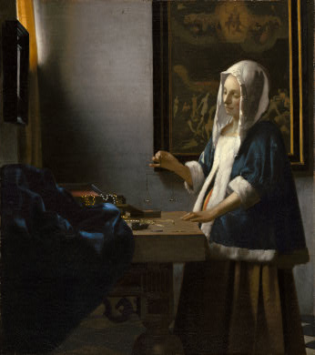
On the Road……Dali and Vermeer @ National Gallery of Art, Wash DC
Just outside the main entrance to the National Gallery of Art.
It’s always worth a visit here if only to experience the museum’s four paintings by Vermeer and Salvador Dali’s “The Sacrament of the Last Supper”.
I’m not sure if it’s true, but I heard that Dali required this painting to be displayed alone, in it’s own viewing room.
The museum has honored the request to some degree, by putting it in a mezzanine, stairway-like area by itself…but I’m not sure this genuinely honors the spirit of Dalil’s wishes.
And the master of light, Vermeer, I’ve now learned used a camera obscura in his artistic process. When the reflected light of a scene was projected onto a viewing screen, the device would selectively blur certain areas (as does the human eye) and identify precise areas of bright or specular highlights (e.g. the pearl necklaces in the jewelry case below).
Vermeer probably analyzed the camera obscura results to help render his sublime paintings — thus, painting with light!
Biking Culture……The bicycle as Objet d’Art
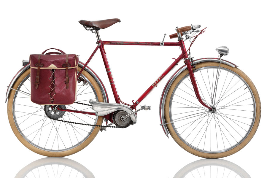
Michael Embacher is a passionate bicycle enthusiast and collector. He has a very slick website that showcases his collection. He also has a new book, Cyclepedia: a century of iconic bicycle design. Here’s a blurb from the publisher, Chronicle Books:
An homage to the beauty of the bike, Cyclepedia showcases the innovations and legacies of bicycle design over the past century. Join longtime bike enthusiast and avid collector Michael Embacher for a tour of 100 bicycles, from the finest racing bikes and high-tech hybrids to the bizarrely specific (such as a bike designed to cycle on ice). Captivating photographs, detailed component lists, and anecdotal information illuminate the details that make each bicycle unique.
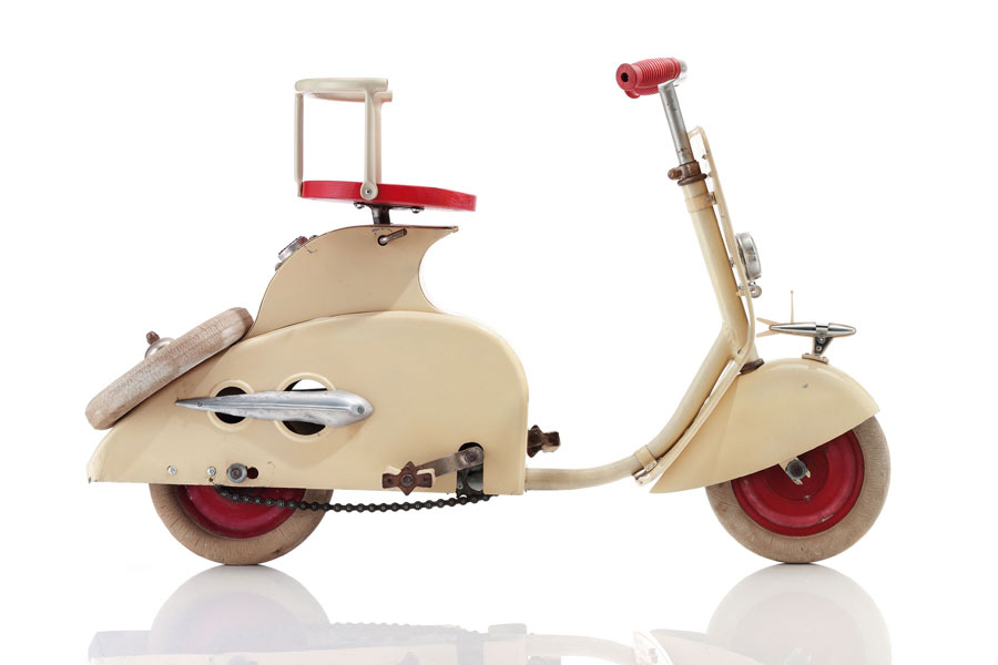
A brilliant concept: a bicycle disguised to look like a Vespa! This was produced by a French toy manufacturer (to capture the attention of children no doubt, but I’d buy one). See more details at the Embacher Collection.
Bicycle Culture……Bicycle poster art
http://www.flickr.com/photos/sfac/5974840106/
Artist: Ian Huebert
“The Golden Spoke: Fog” and “The Golden Spoke: To Market”
Art on Market Street Poster Series
Courtesy of the San Francisco Arts Commission.
Re-posted from Copanhagenize
Biking Culture……Bill Cuningham: “He who seeks beauty shall find it.”
Bill Cunningham New York is a fascinating film about an 80-something-year-old man who bicycles around Manhattan and takes pictures of street fashion for his column in The New York Times.
He’s been doing this for nearly a half-century (with 28 bikes stolen) while living a monk-like existence in what is, essentially, a closet above Carnegie Hall with no kitchen and no bathroom.
He has no apparent interest in the superficial aspects of haute couture. The famous people who court him hold no power over him (he won’t even accept a glass of water from the hosts when shooting a high society gala event). Despite this simple, down-to-earth demeanor, Cunningham is a complex character and his deeper philosophy is suggested by what is perhaps the most famous quote of his from the film:
The wider world perceives fashion as a frivolity that should be done away with. The point is fashion is the armor to survive the reality of everyday life. I don’t think you can do away with it. It would be like doing away with civilization.
And when honored with the Officier de l’ordre des Arts et des Lettres by the French Ministry of Culture in Paris he tearfully reminds us that: “He who seeks beauty shall find it.” At that moment we, the audience, are aware that this is the larger purpose to which Cunningham has dedicated his life.
I enjoyed the film because of its depiction of this individual’s extraordinary humanity and because it was great fun to see him trundle around NYC taking photographs on his bicycle.
I’m not particularly interested in fashion, but I thought this was a spectacular film about a true artist.
This is one of his weekly ‘On the Street’ videos exploring NYC’s version of Ciclovia (note: I wrote about San Francisco’s version of this event here; Tucson has its own Cyclovia too).
Bicycling Culture……Manufactured Totems, by Alain Delorme
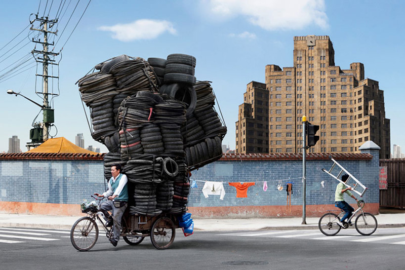
The photographer Alain Delorme has a wonderful series called Manufactured Totems, perhaps inspired by these images of overloaded Asian scooters.
His images remind me of the quirky Camper Bike.
I also posted my own contribution to this genre a while back.
Here are some notes about the Totem series as only a French Photography Historian could write them (the full test is available on Alain Delormes’s website):
“The vertiginous height of the piles echoes the incessant expansion of the city itself. By updating the proposition of the Becher, Alain Delorme seems to create a parallel between these manufactured totems and the buildings in the background, which have become themselves contemporary sculptures. The urban space is permanently under construction, developing relentlessly. The skyscrapers invade the city and rise always higher, such as new totems, always more remarkable, always more impressing. Stratum by stratum, traditional China rubs shoulders with the contemporary industrial superpower. The race here is not only the one of the men in the city, but also the one of the city towards its future.”
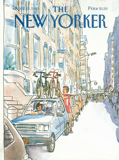
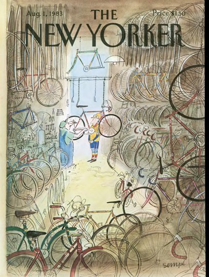
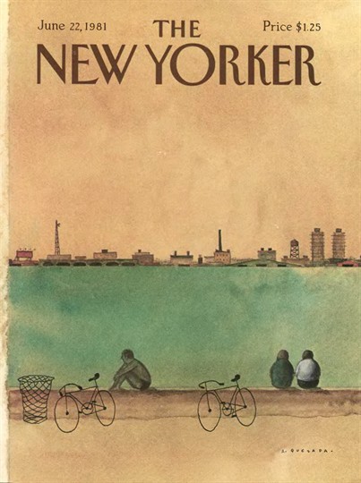
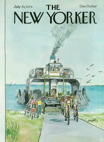
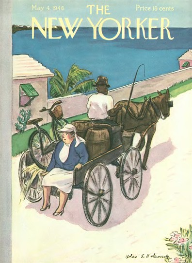
Bicycling Culture……The New Yorker: Bicycling Covers, Part II
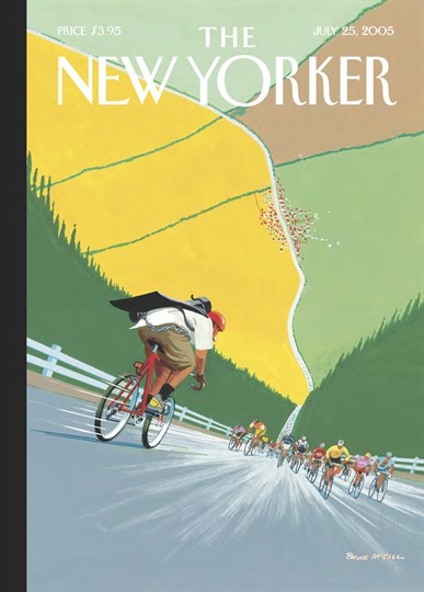
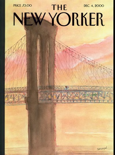
Part II in an on-going series of posts demonstrating The New Yorker’s fondness for bicycle cover art (see also Part I).
Note: all covers going back to 1925 are archived on the magazine’s website.
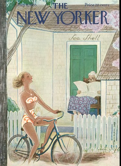
Bicycling Culture……The New Yorker: Bicycle Covers
I think The New Yorker has a thing for bicycles. The cover from the August 2, 2010 issue is below, followed by some other beauties from the archives.
Random Images……Photographer, August Sander
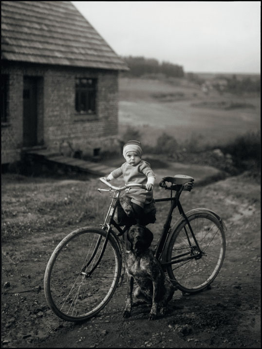
August Sander, Forester’s Child, Westerwald, 1931. Gelatin silver print, 10-3/16 x 7-1/2 inches. Copyright © SK-Stiftung Kultur – August Sander Archiv VG-Bild Kunst, Bonn. Deborah Bell Photographs
August Sander is one of the most esteemed portrait photographers the medium has produced. I did not know of this image, however, until discovering it in the current issue of The New Yorker magazine.
The geo-link below the photo is only accurate at the level of the town (it would be interesting to track down the exact location).
Since I’ve already digressed so greatly from the Angel Island ride report and photos I keep wanting to post, I may as well list some other (mostly contemporary) photographers that interest me (in no particular order):
- Pirkle Jones
- Joel Sternfeld
- Clyde Butcher
- Saul Leiter
- Christopher Burkett
- Michael Kenna
- Edward Burtynsky
- Stephen Shore
- Edward Weston
- Mathew Chase-Daniel
- William Eggleston
- Chris Jordon
- Clark Little
- Jim Balog
And then there’s my current favorite photographer, Laura Mcphee.
Biking Culture……Behold: the Camper Bike
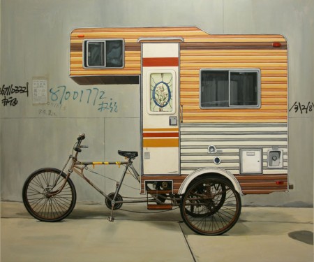
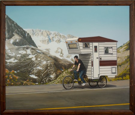
I recently discovered Brooklyn artist Kevin Cyr and his delightful Camper Bike.
From the artist’s website:
Camper Bike, a functioning sculptural piece, built in April 2008. A stand alone piece and the subject of a series of paintings.
Here’s what he said about the Camper Bike‘s origins in an article on a companion piece, Camper Kart.
“I was eating breakfast in a village outside Beijing when I suddenly had this bizarre feeling like I was camping,” remembers Cyr. That feeling, combined with China’s robust cycling culture, was the genesis for the creation of Cyr’s first vehicle, “Camper Bike,” in which he attached a fully functional 3-by-9-foot camper to a three-wheeled Chinese flatbed bike.



 Show on map